コーディングテクニックの実装内容
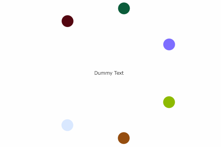
今回はWeb制作におけるCSSアニメーションに関する内容です。@keyframesを使用して丸いオブジェを円形に回転させ続けるアニメーションの実装方法をご紹介します。
コーディングテクニックの使いどころ
セクションの変わり目や目立たせたい箇所で適用させるのが効果的な使い方となります。
実装難易度・必要なスキル
コーディングとjQueryの基礎的な知識があれば実務未経験のコーダー、マークアップエンジニア、Webデザイナー、エンジニア、副業の初心者など誰でも実装可能です。
実装所要時間は10分程度
CSS,JavaScriptの記述内容
.block {
  position: relative;
  width: 360px;
  margin: 150px auto 0;
  text-align: center;
}

.block .list {
  position: relative;
  width: 360px;
  height: 360px;
}

.block .list li {
  position: absolute;
  left: 0;
  top: 0;
  width: 180px;
  height: 180px;
  transform-origin: 100% 100%;
  opacity: 0;
}

.block .list li span {
  position: relative;
  display: block;
  width: 40px;
  height: 40px;
  border-radius: 50%;
  background: #000;
  transition: transform .3s linear;
}

.block .list li span:before {
  content: '';
  position: absolute;
  left: 0;
  top: 0;
  display: block;
  width: 100%;
  height: 100%;
  border-radius: 50%;
  opacity: .5;
  transition: transform .1s linear;
}

.block .list li.c-01 {
  transition: opacity .3s ease-out .2s;
  animation: rotation 70s linear infinite;
  transform: rotate(0);
}

.block .list li.c-01 span {
  background: #560f1b;
}

.block .list li.c-02 {
  transition: opacity .3s ease-out .4s;
  animation: rotation 70s linear -10s infinite;
  transform: rotate(51deg);
}

.block .list li.c-02 span {
  background: #055a3b;
}

.block .list li.c-03 {
  transition: opacity .3s ease-out .6s;
  animation: rotation 70s linear -20s infinite;
  transform: rotate(102deg);
}

.block .list li.c-03 span {
  background: #6b7cff;
}

.block .list li.c-04 {
  transition: opacity .3s ease-out .8s;
  animation: rotation 70s linear -30s infinite;
  transform: rotate(153deg);
}

.block .list li.c-04 span {
  background: #91b700;
}

.block .list li.c-05 {
  transition: opacity .3s ease-out 1s;
  animation: rotation 70s linear -40s infinite;
  transform: rotate(204deg);
}

.block .list li.c-05 span {
  background: #984000;
}

.block .list li.c-06 {
  transition: opacity .3s ease-out 1.2s;
  animation: rotation 70s linear -50s infinite;
  transform: rotate(255deg);
}

.block .list li.c-06 span {
  background: #56b2ff;
}

.block .list li.c-07 {
  transition: opacity .3s ease-out 1.4s;
  animation: rotation 70s linear -60s infinite;
  transform: rotate(306deg);
}

.block .list li.c-07 span {
  background: #000000;
}

.block .text {
  position: absolute;
  top: 50%;
  left: 50%;
  transform: translate(-50%, -50%);
}

.block.active .list li {
  opacity: 1;
  filter: alpha(opacity=100);
}

@keyframes rotation {
  0% {
   transform: rotate(0);
  }
  100% {
  transform: rotate(360deg);
  }
}

@media screen and (max-width:640px){
  .block {
    width: 300px;
  }

  .block .list {
    width: 300px;
    height: 300px;
  }

  .block .list li {
    width: 140px;
    height: 130px;
  }
}
実装のポイント
- 1) animationプロパティ、@keyframes使用
- 2) ループアニメーション
PR
![[商品価格に関しましては、リンクが作成された時点と現時点で情報が変更されている場合がございます。]](https://hbb.afl.rakuten.co.jp/hgb/4d95674f.5ea53f98.4d956750.ba046f97/?me_id=1285657&item_id=12998944&pc=https%3A%2F%2Fthumbnail.image.rakuten.co.jp%2F%400_mall%2Fbookfan%2Fcabinet%2F01141%2Fbk4046071877.jpg%3F_ex%3D240x240&s=240x240&t=picttext "[商品価格に関しましては、リンクが作成された時点と現時点で情報が変更されている場合がございます。]")

アニメ・漫画の登場人物やゲームキャラクターの現在の年齢まとめ
X(旧Twitter)やYouTube、TikTok、SNSで話題の猫(ネコ、ねこ)情報まとめ
犬(ワンちゃん)を飼っている意外な有名人・タレント・芸人・インフルエンサー・YouTuberまとめ
TikTokで人気急上昇のTikToker(ティックトッカー)情報まとめ
スポンサーリンク
「【CSS】@keyframesを使用して丸いオブジェを円形に回転させ続けるアニメーションの実装方法」への1件のフィードバック
コメントは受け付けていません。